| 2. AWT 1.1 Components | ||
|---|---|---|
 | Chapter 23. Extra: Graphic User Interface - AWT |  |
| 2. AWT 1.1 Components | ||
|---|---|---|
| | Chapter 23. Extra: Graphic User Interface - AWT | |
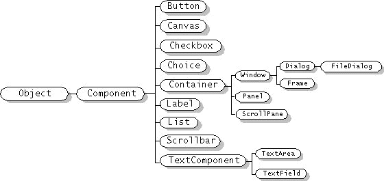
AWT Component
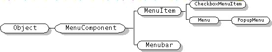
AWT MenuComponent
![[Note]](../../images/note.png) | Note |
|---|---|
Because of cross-platform restrictions, menu-related components aren't full-blown Components |
For any Component object except a Window to display itself onscreen, you must first add it to a Container object.
The Container class defines three methods for adding components:
add(Component comp) method simply requires that you specify the component to add.
add(Component comp, int ind) method lets you add an argument specifying the integer position at which the component should be added.
add(String pos, Component comp) method has as first argument a layout manager-dependent string that specifies the component's position to the layout manager.
| Note |
|---|---|
Adding a component to a container removes the component from the container it used to be in (if any). |
Basic drawing support.
Component provides the paint(), update(), and repaint() methods, which enable Components to draw themselves onscreen.
Event handling
Component defines the general-purpose handleEvent() method and a group of methods such as action() that handle specific event types.
Appearance control: font
Component provides methods to get and set the current font, and to get information about the current font.
Appearance control: color
Component provides methods to get and set the foreground and background colors.
Image handling
Component provides the basis for displaying images. Canvases and most Containers can display images.
Onscreen size and position control
Component provides methods that get or set (subject to layout manager oversight) the component's current size and location.
The Button class provides a default button implementation. A button is a simple control that generates an action event when the user clicks it.
b1 = new Button();
b1.setLabel("Disable middle button");
b1.setActionCommand(DISABLE);
b2 = new Button("Middle button");
b3 = new Button("Enable middle button");
b3.setEnabled(false);
b3.setActionCommand(ENABLE);
//Listen for actions on buttons 1 and 3.
b1.addActionListener(this);
b3.addActionListener(this);

. . .

public void actionPerformed(ActionEvent e) {
    String command= e.getActionCommand();
    if (command==DISABLE) { //They clicked "Disable middle button"
        b2.setEnabled(false);
        b1.setEnabled(false);
        b3.setEnabled(true);
    }
    if (command == ENABLE) { //They clicked "Enable middle button"
        b2.setEnabled(true);
        b1.setEnabled(true);
        b3.setEnabled(false);
    }
}The Label class provides an easy way of putting unselectable text in your program's GUI. Labels are aligned to the left of their drawing area, by default.
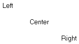
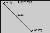
The Canvas class exists to be subclassed. It does nothing on its own; it merely provides a way for you to implement a custom Component
class ImageCanvas extends Canvas {
      Container pappy;
      Image image;
      boolean trueSizeKnown = false;
      Dimension minSize;

      public ImageCanvas(Image image, Container parent, int w, int h) {
             if (image == null) {
                 System.err.println("Canvas got invalid image object!");
                 return;
             }
             this.image = image;
             pappy = parent;
             minSize = new Dimension(w,h);
      }

      public Dimension getPreferredSize() { return getMinimumSize();}

      public Dimension getMinimumSize() { return minSize;}

      public void paint (Graphics g) {
             if (image != null) {
                 if (!trueSizeKnown) {
                    int width= image.getWidth(this);
                    int height= image.getHeight(this)
                    if ((imageWidth > 0) && (imageHeight > 0)) {
                        trueSizeKnown = true;
                        //Component-initiated resizing.
                        minSize = new Dimension(width,height);
                        setSize(width, height);
                        pappy.validate();
                    }
                 }
                 g.drawRect(0, 0, minSize.width - 1, minSize.height - 1);
                 g.drawImage(image, 0, 0, this);
            }
      }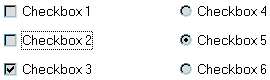
}Checkboxes are two-state buttons that can be either "on" or "off". When the user clicks a checkbox, the checkbox state changes and it generates an action event.
cb1 = new Checkbox();   //Default state is "off" (false).
cb1.setLabel("Checkbox 1");
cb3 = new Checkbox("Checkbox 3");
cb3.setState(true);     //Set state to "on" (true).
cbg = new CheckboxGroup();
cb4 = new Checkbox("Checkbox 4", cbg, false); //initial state: off (false)
cb5 = new Checkbox("Checkbox 5", cbg, false); //initial state: off
cb6 = new Checkbox("Checkbox 6", cbg, false); //initial state: off
The Choice class provides a menu-like list of choices, accessed by a distinctive button. The user presses the button to bring up a "menu", and then chooses one of the items.
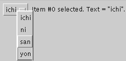
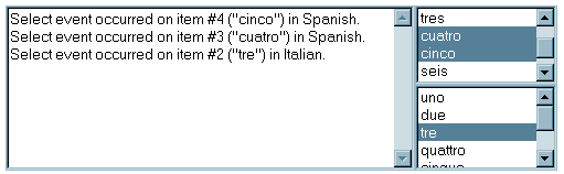
The List class provides a scrollable area containing selectable text items.
//Build lists, which allows multiple selections.
spanish = new List(4, true); //prefer 4 items visible
spanish.add("uno");
. . .
spanish.add("siete");
spanish.addActionListener(this);
spanish.addItemListener(this);

italian = new List(); //Defaults to none visible, only one selectable
italian.add("uno");
. . .
italian.add("sette");
italian.addActionListener(this);
italian.addItemListener(this);
. . .
public void actionPerformed(ActionEvent e) {
       List list= (List) e.getSource();
       String language = (list == spanish) ? "Spanish" : "Italian";
       output.append("Action event occurred on \""
                     + list.getSelectedItem() + "\" in "
                     + language + ".\n");
}

public void itemStateChanged(ItemEvent e) {
       List list= (List) e.getItemSelectable();
       String language = (list == spanish) ? "Spanish" : "Italian";

       int index = ((Integer)(e.getItem())).intValue();
       if (e.getStateChange() == ItemEvent.SELECTED) {
           output.append("Select event occurred on item #"
                          + index + " (\""
                          + list.getItem(index) + "\") in "
                          + language + "." + newline);
       } else { //the item was deselected
           output.append("Deselect event occurred on item #"
                          + index + " (\""
                          + list.getItem(index) + "\") in "
                          + language + "." + newline);
       }
}A ScrollPane manages a single child component, displaying as much of the component as space permits.
By default, a scroll pane's scrollbars are visible only when they're needed.
SCROLLBARS_AS_NEEDED
The default value. Show each scrollbar only when it's needed.
SCROLLBARS_ALWAYS
Always show scrollbars.
SCROLLBARS_NEVER
Never show scrollbars. You might use this option if you don't want the user to directly control what part of the child component is shown.
Example
ScrollPane sp2 = new ScrollPane(ScrollPane.SCROLLBARS_ALWAYS);
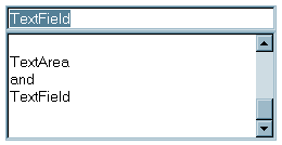
The TextComponent derived classes, TextArea and TextField, display selectable text and, optionally, allow the user to edit the text.
From TextComponent this classes inherit methods that allow them to set and get the current selection, enable and disable editing, get the currently selected text (or all the text), and set the text.
Component
|
TextComponent
|
+--------------+
| |
TextArea TextField
//Where instance variables are defined:
TextField textField;
TextArea textArea;

public void init() {
    textField = new TextField(20);
    textField.addActionListener(this);
    textArea = new TextArea(5, 20);
    textArea.setEditable(false);

    ...//Add the two components to the panel.
}

public void actionPerformed(ActionEvent evt) {
    String text = textField.getText();
    textArea.append(text + "\n");
    textField.selectAll();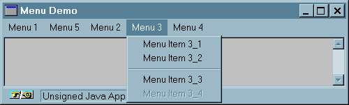
}The following applet shows many of the menu features you're likely to use.
| Note |
|---|---|
|
MenuItem
Each item in a menu is represented by a MenuItem object.
CheckboxMenuItem
Each menu item that contains a checkbox is represented by a CheckboxMenuItem object.
Menu
Each menu is represented by a Menu object. Menu is a subclass of MenuItem so that you can create a submenu by adding one menu to another.
Popupmenu
Represents a popup menu.
MenuBar
The MenuBar class represents the platform-dependent notion of a group of menus attached to a window. MenuBars can not be bound to Panels.
Copyright © 1998-2009 Dilvan Moreira
| |  | |
| 1. Overview |  | 3. AWT 1.1 Menus |
 Audio in
Portuguese
Audio in
Portuguese