| 3. Swing Components | ||
|---|---|---|
 | Chapter 10. Graphic User Interface |  |
| 3. Swing Components | ||
|---|---|---|
| | Chapter 10. Graphic User Interface | |
For any Component object except a
JFrame to display itself onscreen, you must
first add it to a Container object.
The Container class defines three
methods for adding components:
add(Component comp) method simply
requires that you specify the component to add.
add(Component comp, int ind)
method lets you add an argument specifying the integer position
at which the component should be added. This argument is also
used to determine the layout manager-dependent position at which
the component should be added.
add(String pos, Component comp)
method has as first argument a layout manager-dependent string
that specifies the component's position to the layout
manager.
![[Note]](../../images/note.png) | Note |
|---|---|
Adding a component to a container removes the component from the container it used to be in (if any). |
Basic drawing support
Component provides the
paint(), update(), and repaint()
methods, which enable components to draw themselves on
screen.
Event handling
Component defines the
general-purpose handleEvent() method
and a group of methods such as action()
that handle specific event types.
Appearance control: font
Component provides methods to get
and set the current font, and to get information about the
current font.
Appearance control: color
Component provides methods to get
and set the foreground and background colors.
Image handling
Component provides the basis for
displaying images. Most containers can display images.
Onscreen size and position control
Component provides methods that get
or set (subject to layout manager oversight) the component's
current size and location.
The JButton class provides a default button implementation. A button is a simple control that generates an action event when the user clicks it.
b1 = new JButton();
b1.setText("Disable middle button");
b1.setActionCommand(DISABLE);

b2 = new JButton("Middle button");

b3 = new JButton("Enable middle button");
b3.setEnabled(false);
b3.setActionCommand(ENABLE);

// Listen for actions on buttons 1 and 3.
b1.addActionListener(this);
b3.addActionListener(this);

...

public void actionPerformed(ActionEvent e) {
    String command = e.getActionCommand();
    if (command == DISABLE) { // User clicked "Disable middle button"
        b1.setEnabled(false);
        b2.setEnabled(false);
        b3.setEnabled(true);
    }
    if (command == ENABLE) { // User clicked "Enable middle button"
        b1.setEnabled(true);
        b2.setEnabled(true);
        b3.setEnabled(false);
    }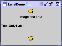
}The JLabel class provides an easy way of putting unselectable text in your program's GUI. Labels are aligned to the left of their drawing area, by default.
ImageIcon icon = new ImageIcon("images/middle.gif");

JLabel lbl1 = new JLabel("Image and Text", JLabel.CENTER);
lbl1.setIcon(icon);

// Set the position of the text, relative to the icon:
lbl1.setVerticalTextPosition(JLabel.BOTTOM);
lbl1.setHorizontalTextPosition(JLabel.CENTER);

JLabel lbl2 = new JLabel("Text-Only Label");

JLabel lbl3 = new JLabel(icon);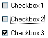
lbl3.setHorizontalAlignment(JLabel.CENTER);Checkboxes are two-state buttons that can be either "selected"
or "deselected" . When the user clicks a checkbox, the checkbox state
changes and generates an action event. The
JCheckBox class implements the Swing version of
checkboxes.
cb1 = new JCheckBox(); // Default state is "deselected" (false)
cb1.setText("Checkbox 1");

cb2 = new JCheckBox("Checkbox 2");

cb3 = new JCheckBox("Checkbox 3");
cb3.setSelected(true); // Set state to "selected" (true)

// Register a listener for the checkboxes
cb1.addItemListener(this);
cb2.addItemListener(this);
cb3.addItemListener(this);

...

public void itemStateChanged(ItemEvent e) {
    Object src = e.getItemSelectable();
    if (src == cb1) {
        if (e.getStateChange() == ItemEvent.SELECTED)
            System.out.println("Checkbox 1 selected.");
        else System.out.println("Checkbox 1 unselected.");
    } else if (src == cb2) {
        ...
    } else if (src == cb3) {
        ...
    }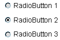
}Radio buttons are similar to checkboxes with the difference that
you can group them to ensure that only one checkbox is selected at a
time. In Swing, each JRadioButton is added to a
ButtonGroup so the group behaves as a set of
radio buttons.
rb1 = new JRadioButton("RadioButton 1");

rb2 = new JRadioButton("RadioButton 2");
rb2.setSelected(true);

rb3 = new JRadioButton("RadioButton 3");

// Group the radio buttons
ButtonGroup grp = new ButtonGroup();
grp.add(rb1);
grp.add(rb2);
grp.add(rb3);

// Register a listener for the radio buttons
rb1.addActionListener(this);
rb2.addActionListener(this);
rb3.addActionListener(this);

...

public void actionPerformed(ActionEvent e) {
    Object src = e.getSource();
    if (src == rb1) {
        System.out.println("RadioButton 1 selected!");
    } else if (src == rb2) {
        ...
    } else if (src == rb3) {
        ...
    }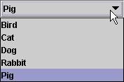
}The JComboBox class provides a menu-like
list of choices, accessed by a distinctive button. The user presses
the button to bring up a "menu", and then chooses one of the
items.
String[] str = { "Bird", "Cat", "Dog", "Rabbit", "Pig" };

// Create the combo box, select item at index 4
// Indices start at 0, so 4 specifies the pig

JComboBox cb = new JComboBox(str);
cb.setSelectedIndex(4);
cb.addActionListener(this);

...

public void actionPerformed(ActionEvent e) {
    JComboBox cb = (JComboBox) e.getSource();
    System.out.println("User chose " + ((String) cb.getSelectedItem()));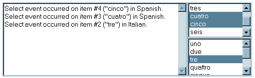
}The JList class provides an list of
selectable items. These items can be composed of text, images, or
both.
// Build the lists, which allows multiple selections
String[] elements = { "uno", "dos", "tres", "cuatro", "cinco", ... };
spanish = new JList(elements);
spanish.addListSelectionListener(this);
spanish.setSelectionMode(ListSelectionModel.MULTIPLE_INTERVAL_SELECTION);

italian = new JList(new DefaultListModel());
italian.addListSelectionListener(this);
italian.setSelectionMode(ListSelectionModel.MULTIPLE_INTERVAL_SELECTION);

// Add data using the list model
DefaultListModel model = (DefaultListModel) italian.getModel();
model.addElement("uno");
model.addElement("due");
model.addElement("tre");
model.addElement("quattro");
model.addElement("cinque");

. . .

// Implementing the listener for the selection events
public void valueChanged(ListSelectionEvent e) {

    if (e.getValueIsAdjusting()) {
        if (e.getSource() == spanish) {
            int[] indices = spanish.getSelectedIndices();
            Object[] values = spanish.getSelectedValues();
            for (int i = 0; i < indices.length; i++) {
                String item = (String) values[i];
                System.out.println("Select event occurred on item #" +
                       indices[i] + " (\"" + item + "\") in Spanish.");
            }
        }
        else {
            int[] indices = italian.getSelectedIndices();
            DefaultListModel model = (DefaultListModel) italian.getModel();
            for (int i = 0; i < indices.length; i++) {
                String item = (String) model.getElementAt(indices[i]);
                System.out.println("Select event occurred on item #" +
                       indices[i] + " (\"" + item + "\") in Italian.");
            }
        }
    }
}A JScrollPane manages a single child
component, displaying as much of the component as space permits. By
default, a scroll pane's scrollbars are visible only when they're
needed.
HORIZONTAL_SCROLLBAR_AS_NEEDED, VERTICAL_SCROOLBAR_AS_NEEDED
The default value. Show each scrollbar only when it's needed.
HORIZONTAL_SCROLLBAR_ALWAYS, VERTICAL_SCROLLBAR_ALWAYS
Always show the scrollbars.
HORIZONTAL_SCROLLBAR_NEVER, VERTICAL_SCROLLBAR_NEVER
Never show scrollbars. You might use this option if you don't want the user to directly control what part of the child component is shown.
JScrollPane scroll = new JScrollPane(aComponent, JScrollPane.VERTICAL_SCROLLBAR_ALWAYS,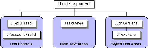
JScrollPane.HORIZONTAL_SCROLLBAR_ALWAYS);The JTextComponent derived classes
display selectable text and, optionally, allow the user to edit the
text. They can also support styled text and password fields.
From JTextComponent this classes
inherit methods that allow them to set and get the current
selection, enable and disable editing, get the currently selected
text (or all the text), and set the text.
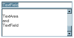
// Where instance variables are defined:
private JTextField textField;
private JTextArea textArea;

public void init() {

    textField = new JTextField(20);
    textField.addActionListener(this);

    textArea = new JTextArea(5, 20);
    textArea.setEditable(false);

    ...// Add the two components to the panel.
}

public void actionPerformed(ActionEvent evt) {
    String text = textField.getText();
    textArea.append(text + "\n");
    textField.selectAll();
}Copyright © 1998-2009 Dilvan Moreira
| |  | |
| 2. Swing Containers |  | 4. Swing Menus |
 Audio in
Portuguese
Audio in
Portuguese